The system supports multiple levels of navigation. In this example we shall see how left-hand navigation can be was achieved. This is an example of level-2 navigation, as it is allowing explicit navigation display of the pages or sections within a section. 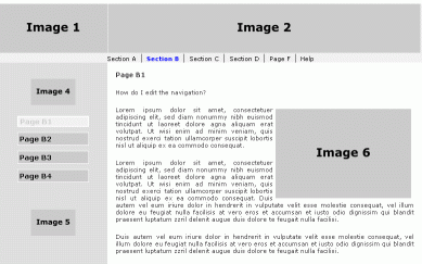
Step 1. To get the Navigation to display in the correct location on the page, you first use the Layout Manager and adjust the Zones in the left layout element to have the desired characteristics. In this case the design of the website calls for an image above and below a navigation made up of buttons that change color as you mouse over them, and indicate the selected page. 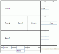 Zones 1, 2 and 3 have been combined. The resulting Zone 1 has been set to 'Image' and an appropriate image has been uploaded using the built-in image edit tool in the local menu, and the background set to be light gray using the Edit Zone Style tool in the local menu. Zones 1, 2 and 3 have been combined. The resulting Zone 1 has been set to 'Image' and an appropriate image has been uploaded using the built-in image edit tool in the local menu, and the background set to be light gray using the Edit Zone Style tool in the local menu.
Zones 4 and 6 have been set to 'Empty' and set to be light gray using the Edit Zone Style tool in the local menu.
Zones 7, 8 and 9 have been combined. The resulting Zone 7 has been set to 'Image' and an appropriate image has been uploaded using the built-in image edit tool in the local menu, and the background set to be light gray using the Edit Zone Style tool in the local menu.
Zone 5 has been set to Navigation and the background set to be light gray using the Edit Zone Style tool in the local menu.
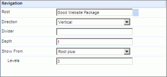
The Navigation Editor setting has been changed from Level 1 to Level 3 (see right). Styling the Navigation 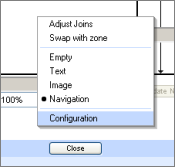
The system will provide a default color-way and font for the navigation You can style the navigation by selecting the navigation 'zone', in the Layout Manager then right-click to access the 'Configuration' where you can access the Style option. A dialog similar to the one shown below will open. 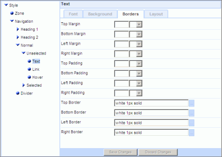
Here is an example 'recipe' that you can use as a basis for your own experiments. Images, buttons and text
Note that for SEO purposes navigation links should always be 'real' text. You can adjust the styling to have background images 'behind' the text if that is what your design requires. Using the Style tool we made the following setting changes: Zone | Background | Background color [#dedede]
Normal | Unselected | Text | Font settings
Font Family select Verdana and promote to the right
Color Black
Size Specific 8 pt
Weight Relative
Normal | Unselected | Text | Background | Background color [#cbcbcb]
Normal | Unselected | Text | Borders | Borders | Style [solid] Color [white] Width Specific 1 px
Normal | Unselected | Text | Layout | Scale | Width 130 px Height 100%
Normal | Unselected | Link A | Font settings
Color Black
Size Specific 10 pt
Weight Absolute [Bold]
Normal | Unselected | Link A | Borders | Padding Top 3px Bottom 3px Left 3px Right 3px
Normal | Unselected | Link A | Layout | Scale | Width 130 px Height 100%
Normal | Unselected | Link A: Hover | Font | Color: [#cbcbcb]
Normal | Unselected | Link A: Hover | Background | Background color [#f1f1f1]
Normal | Selected | Text | Font settings
Font Family select Verdana and promote to the right
Color Black
Size Specific 10pt
Weight Bold
Normal | Selected | Text | Background | Background color [#f1f1f1]
Normal | Selected | Text | Borders | Borders | Style [solid] Width Specific 2 px
Normal | Selected | Text | Layout | Scale | Width 130 px
Normal | Selected | Link A | Font settings
Color [#cbcbcb]
Size Specific 10pt
Weight Bold
Normal | Selected | Link A | Borders | Padding Top 3px Bottom 3px Left 3px Right 3px
Normal | Selected | Link A | Font | Weight: Absolute [Bold]
Divider | Layout | Scale [10 px] | 

