 |
|
|
clearString neatComponents
|
|
clearString neatComponents Navigation for Mobile Devices |
| ||
| Application Development | |
Navigation for Mobile Devices | ||
| |
It is a common scenario to need a separate navigation display for Mobile devices.
A full width navigation zone suitable for a desktop display is not appropriate for a mobile display.
.png)
The solution is to create different navigation Layout Elements for the different situations/widths and then turn them on or off using the display rules.
Preparation
This method requires the use of a Collapsible Panel.
.png)
Add that component to the hidden config. It requires no configuration at this time.
This method takes advantage of a special property of Collapsible Panels when used in the context of Layout Elements
Add Fixed on Viewport Layout Element - Level 1
.png)
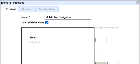
Set the Name to be Mobile Top Navigation ≡ , and configure the Zones as shown above.
≡ in Windows is Alt+240
In Zone 1 embed the Layout Element - Site Header This is configured in the 'Scrolling with the page" set of Layout Elements. It is a single text zone, and contains the site name - Starter Site, Hello World or whatever.
In Zone 2, also set to Text, Embed a Collapsible Panel
.png)
Name the Panel Contents - MobileMenu
Initial State - Closed
Scope - Page
Title...expanded - edit the text surface and add a right-aligned capital X (This will serve to close the menu when it is opened).
Title...collapsed - edit the text surface and add a right-aligned ≡ (This will serve to open the menu when it is closed).
.png)
Set the Position to be fixed on the viewport, anchored in the top-left.
.png)
Set it to display only up to 799 pixels wide. From 800 up it will use the Desktop Top Navigation.
Add Fixed on Viewport Layout Element - Level 2
Set the Content to be Navigation, with width explicitly set to 100%
Configured with:
Root to be the Site Root (Globe node)
Direction - Vertical
Depth - 1
Show from - Root plus:
Levels - 1
.png)
You then create a Navigation Layout Element and position it so that it is fixed on the viewport.
.png)
Then set it to display only when on narrow width displays - less than 800 pixels wide.
Set it to Display using collapsible panels, and give it a Name to match the panels you will be using: MobileMenu
Background
When used in this context the Content of the collapsible panel is provided by contents of the Level 2 Mobile Top Navigation using the Panel Title name channel.
This method enables the mobile menu to stream down the page when called from the ≡ and be closed from the X
Copyright © 2026 Enstar Systems Inc. All rights reserved |