 |
|
|
clearString neatComponents
|
|
clearString neatComponents Query Embed dialog - Components tab |
| ||
| Application Development | |
Query Embed dialog - Components tab | ||
| |
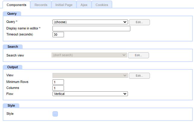
The Components tab is divided into four panels:
- Query
- Search
- Output
- Style
The fields shown in the panels adjust depending on the choices made elsewhere in the dialog, so irrelevant options are not shown.
Query panel
Query
Select the query containing the data to be displayed
Display name in editor
This is automatically populated with the name of the query, followed by the name of the View (as chosen in the Output panel)
The display name can be edited.
The display name is then shown on the surface in edit mode in the Embed blob. The display name is not visible on the surface in view mode (eg when the page is viewed by a user).
Timeout (seconds)
The maximum amount of time the database is allowed to fetch the data. If the timeout is exceeded nothing will be shown.
Default is 30 seconds
Search panel
Search view
Provides a selection of linked components that can provide an interstitial search interface (where a search form is shown, and once submitted is replaced with the rendering of the results)
Note: In most cases a better effect can be obtained instead by configuring a Query by Example component, and embedding that separately on the page. That way the search form remains on screen after submission (allowing for inherent confirmation of the values chosen, and easy adjustment of search values if the user needs to change the search)
Output panel
View
Select on of the Views that have been linked to the query chosen in the Query panel
Note: Some views (notably Grid, CSV and Basic) are configured from within the Query component itself. Other views are separate components, which are configured to be linked to a specific query.
Records Layout
The layout determines how multiple records are arranged on the surface.
This does not apply to all View types (for example, a Dropdown View is a single dropdown with all the records in that, so Layout is not relevant for that). However where there are multiple separate records then, depending on the View type you can select how they are arranged:
The layout options are:
- Table
- In a row (don't wrap)
- In a row (wrap)
- In a column (don't wrap)
- In a column (wrap)
- Raw
The default Layout is "Table". This is the only option for Grid Views.
The other layout options, particular the wrapping ones, are useful as part of responsive designs, where the width of the page is variable.
Table layout
When Table layout is chosen the following supporting fields are shown. These allow for the records to be laid out in multiple row and columns.
- Minimum Rows
The number of rows the records will be arrayed over. This is a minimum (subject to sufficient records being available) before the next column is started.
- Columns
The number of columns the records will be arrayed over
- Flow
Vertical or Horizontal
Note: the number of rows and columns is fixed, and does not respond to variations in the width of the surface it is embedded on. For a responsive layout that does take this into account use one of the other Records Layout options: In a row (wrap), In a column (wrap), or Raw
Paging
For appropriate Views, this settings restricts the display to only show a specified number of records at a time. The user can then use paging controls to navigate to other 'pages' of records. When the user pages, the currently viewed records are replaced with the chosen set of records. If configured, a Loading indicator will display over the top of the currently viewed records to acknowledge the request and indicate the new records are being prepared.
- Use page size (default option, with a default value of 10, maximum 1000)
- Don't use paging (shows all records regardless of how many)
Note: the display and styling of the paging control is specified in the Surround tab
CSV View settings
If a CSV View is selected, the following settings are shown:
Deliver
This has three options:
- As a download
When the page is loaded, instead of the page being delivered to the browser, the CSV file is instead.
Note: If there are multiple such CSV embeds on a page, only the first one will downloaded.
- In page
The CSV will be displayed on screen
- As a link
A link will be rendered on the surface, which the user can click on to start a download of the CSV file to their local machine
Link text
The text to be displayed as a clickable link when 'As a link' is selected in the Deliver setting
Download filename (optional)
For Deliver setting options that result in a file being downloaded to the browser, the name of the file.
Cache for (minutes)
When records are prepared for display, they can be cached on the server so that subsequent requests within the specified timespan will use the cached version rather than preparing them again from the underlying data. Cached data is usually faster to retrieve, but risks not being current.
Caches are sensitive to the scope in which they are being displayed: for example, if the results vary by user, then the cache for one user will not be displayed to a different user.
Default - uses the default cache duration set for the site. This default is shown in brackets against this option
Note: the default cache duration is specified in the Layout Manager, site tree Globe node, Properties, Cache tab
Specified - enter the desired cache duration
Style panel
Style
Embed
This defines the entirety of the area taken up by the embed.
If undefined, the area will be 100% of the available width, and as high as required, but until content is loaded, the height will be 0
Note: If an initial loading content indicator is to be displayed while waiting for ajaxed content to arrive, then the Height or Minimum Height should be specified for this style, otherwise the area default to being 0px high, so the indicator will not have and space in which to display.
Depending on the Layout chosen, you can style one or two further div objects:
- Container - this surrounds all the records. (Note, this should not be confused with Surround components, which if selected will wrap around the outside of the Container.)
Style values can be specified directly in the style dialogs, or they can be set to take values from Themes or from Field values in the query being embedded.
When the Container style is set to use a Field value, it takes values from the first record returned (if the user pages to see different records, the Container will re-render using values from the fields in first record now shown).
- Record - this is an object surrounding an individual record (not applicable for Table layout)
Style values can be specified directly in the style dialogs, or they can be set to take values from Themes or from Field values in the query being embedded.
Record styling from Fields takes values from the individual record being rendered, so each record could have a different styling.
Flex - The Record object, in addition to the normal styling options, can have flex-grow, flex-shrink, and flex-basis specified.
Class Names
In the style dialog you can specify Class names for the Container and the Records. This can be used if you need to reference them from within scripts. (Other class names used by the system are subject to change so should not be relied upon by external scripts)
Implementation notes:
The "Table" layout wraps the records in an HTML table grid.
The "In a row" and "In a column" layout options use the css display:flex system to manage their rendering.
"Raw" renders each record as a simple div with minimum markup, allowing the Styling dialog or a script (using the Class Name) to specify their layout.
Copyright © 2026 Enstar Systems Inc. All rights reserved |